Context aware colors
Friends! Colleagues! Patrons of this fine newsletter! I saw a post today that hit me like a ton of bricks. But first, some context.
Many moons ago I was experimenting with blend modes in CSS, working on a hacky demo where the text color of an element would adapt to its background. This could be handy in all sorts of situations like design systems or allowing folks to create their own themes on a website, but I was focused on this one loading state pattern I’ve seen in the past.

I’m using mix-blend-mode: difference; in this CSS loading bar and that only appears to work in Firefox and is completely borked in Chrome all these years later for reasons that are beyond me. Maybe it’s a bug that it worked at all? Either way, I knew this was a dirty hack at the time but I still think it was a super neat idea. It would be great for accessibility! And perhaps it would cull a lot of unnecessary JavaScript and complexity in our stylesheets! If only the text-color could be aware of the background color! The dream!
But I dropped the idea and never investigated further.
That is, until today when I spotted a fantastic demo by miunau where he figured it all out. So I spun up a quick demo to understand miunau’s approach and it looks something like this:
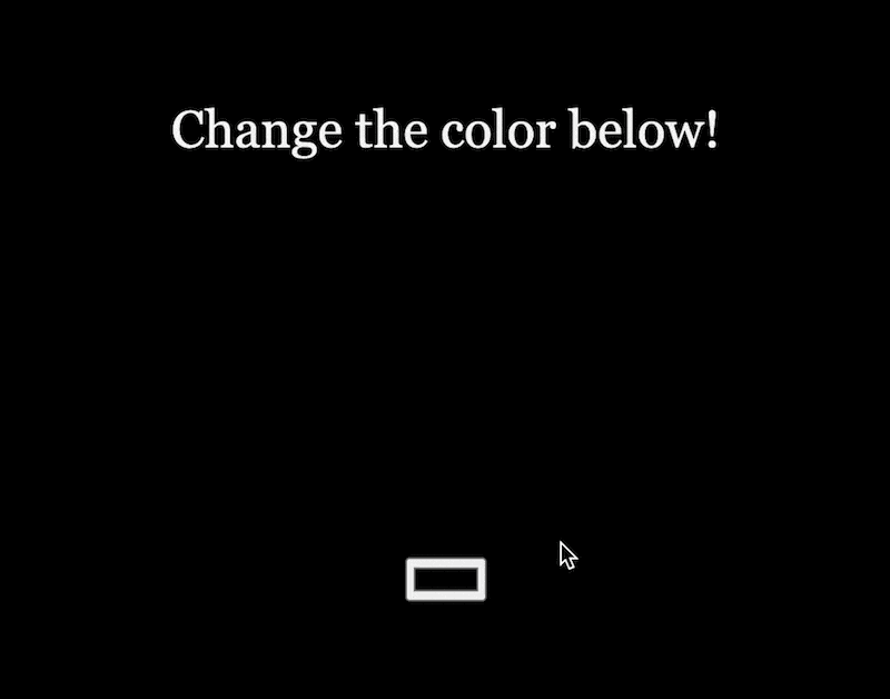
Notice how the text color changes as the background gets lighter or darker? That’s context-aware colors! The thing I’ve been waiting for this whole time! The CSS looks like something like this:
:root {
  --bgColor: #000000;
}

.wrapper {
  background: var(--bgColor);
}

span {
  color: var(--bgColor);
  filter: invert(1) grayscale(1) brightness(1.3) contrast(9000);
  mix-blend-mode: luminosity;
  opacity: 0.95;
}
I knew the right approach would need mix-blend-mode! At the time I just couldn’t do the really smart part that miunau did here, mixing all these filters together with the CSS variable to get the intended effect. (You don’t really need the opacity here, that’s just to make the text color a bit nicer looking.)
But isn’t this super smart? Miriam Suzanne also made an even better pen than mine where you can experiment with the hue, saturation, and lightness to see what happens under the hood.
Context-aware colors are now a real thing! I am excited! And angry that I didn’t figure it out!
See you in the cascade,
Robin