Allo! I’m Robin, a designer and writer from the UK but now I live in San Francisco.

This is where I experiment with storytelling and browsers, rant about typography, and work in public.

There’s many ways to think of a personal website but to explain how I see this place we have to go back…

…way back to 1987.
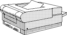
In the summer of that year, a proto-internet emerged called HyperCard. (Yes, this is how I greet people at parties).
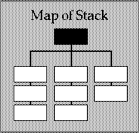
It was designed to help folks write apps—or “stacks” as they called them—and it was way ahead of its time. With HyperCard you could bundle stories and games together, or even learn how to program from scratch. It was a beautiful mess.
I’ve always loved that word—stacks!—and it’s perfect to describe this website of mine: bundles of disorganized and chaotic gatherings of pure, raw stuff. It’s all so messy! And embarrassing! Don’t look over there!
Sure, my website is just a website about websites but if you look closely there’s a few topics in the stack that keep returning.
First: reading, writing, and publishing—the shape of text on screens.
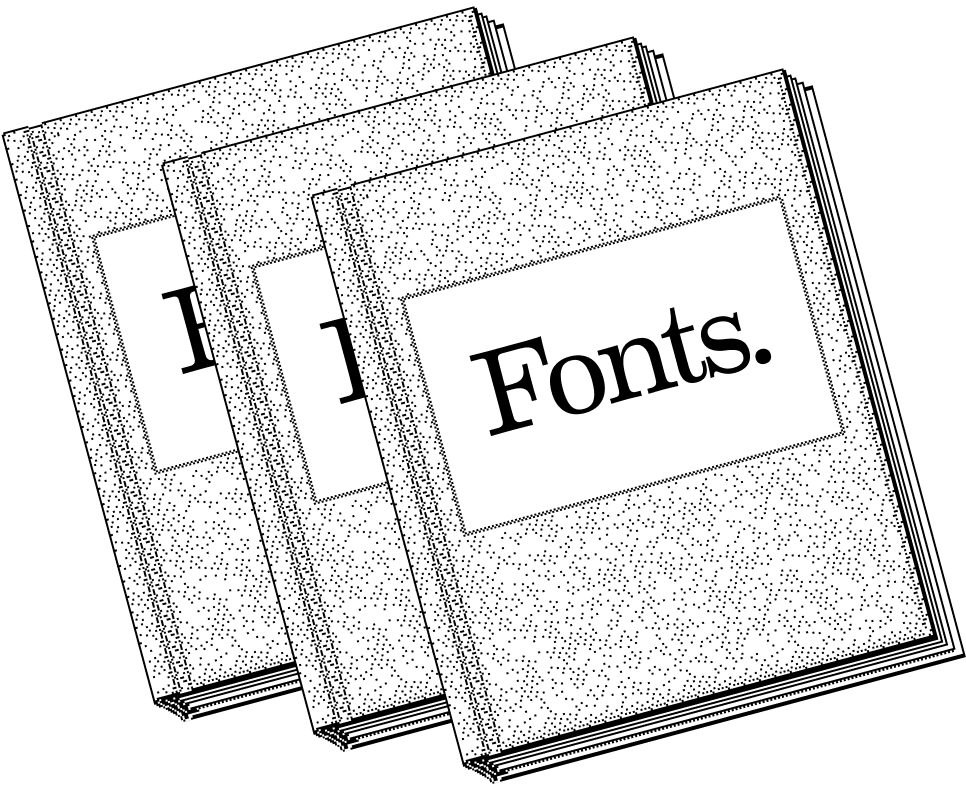
Second: graphic design and web typography that’s all tuned in, with every flourish and detail cared for.
Third: figuring out how to organize folks to make punk rock software (if there is such a thing).
I’ll admit I’ve drunk the cyberpunk koolaid of 1995 and 1987 and every year in-between where networked computers were seen as an adventure. And so I still believe that websites can be as beautiful or, sometimes, even more beautiful than a handmade book.

Just in their own way.
My excitement here might sound unhinged since websites in 2024 often feel like a burden we have to endure. When we boot up a browser and dial in a URL, how often do we brace ourselves for impact?
It feels like we’ve collectively given up on the hope of making a new kind of graphic design or a new kind of literature along the way. Websites are boring now. The frontier has been seized. We’re too late.
I believe (perhaps naively!) that we haven’t figured out everything that a website can be just yet. The constraints, the screens, the responsiveness! Where does all that lead?
I reckon we haven’t figured out the web in the same way that great book designers haven’t figured out all the things a book can be yet, 500 hundred years after the reinvention of movable type.

So everything about my work makes that argument in varying degrees of loudness: websites can and should aspire to be so much more than they are today.
And that’s what my website—my stack—aspires to be, too.
