Search Concepts
Searching for problems sucks, especially when it requires a lot of unnecessary clicking and typing. So these concepts were designed to help Sentry customers spend more time fixing bugs and less time searching for relevant issues.
During user research I noticed how engineers would always filter issues by release, assignee, or environment. This required an awful lot of typing and clicking to get to the issues that they cared about most; a lot of manual work was required to get to the good stuff.
First off, I looked into the data to find the most common search terms. Once I had a nice prioritized list, I began exploring potential solutions.

How can we make the entire interface customizable? In this first concept engineers could select whatever filters are important for them. This could’ve been helpful for both large and small engineering teams since they tend to search for different filters—smaller teams didn’t care at all about assignment for example.
So what if you could just remove the filters you don’t care about?
There was a bit of push-back about this design! Users were already overwhelmed with the amount of options on this page and now this design introduced even more. And what about the filters and keys that we introduce in the future? What about custom tags that engineers could add to Sentry? This design failed to answer these questions.

In the next concept, shown above, I explored making it easier to get to these important search terms right away.
The more I considered this approach, the less effective I realized it was: we needed to make it clear that filtering applied only to search and not to the main page filters. This led me to the next design though, so all was not lost...

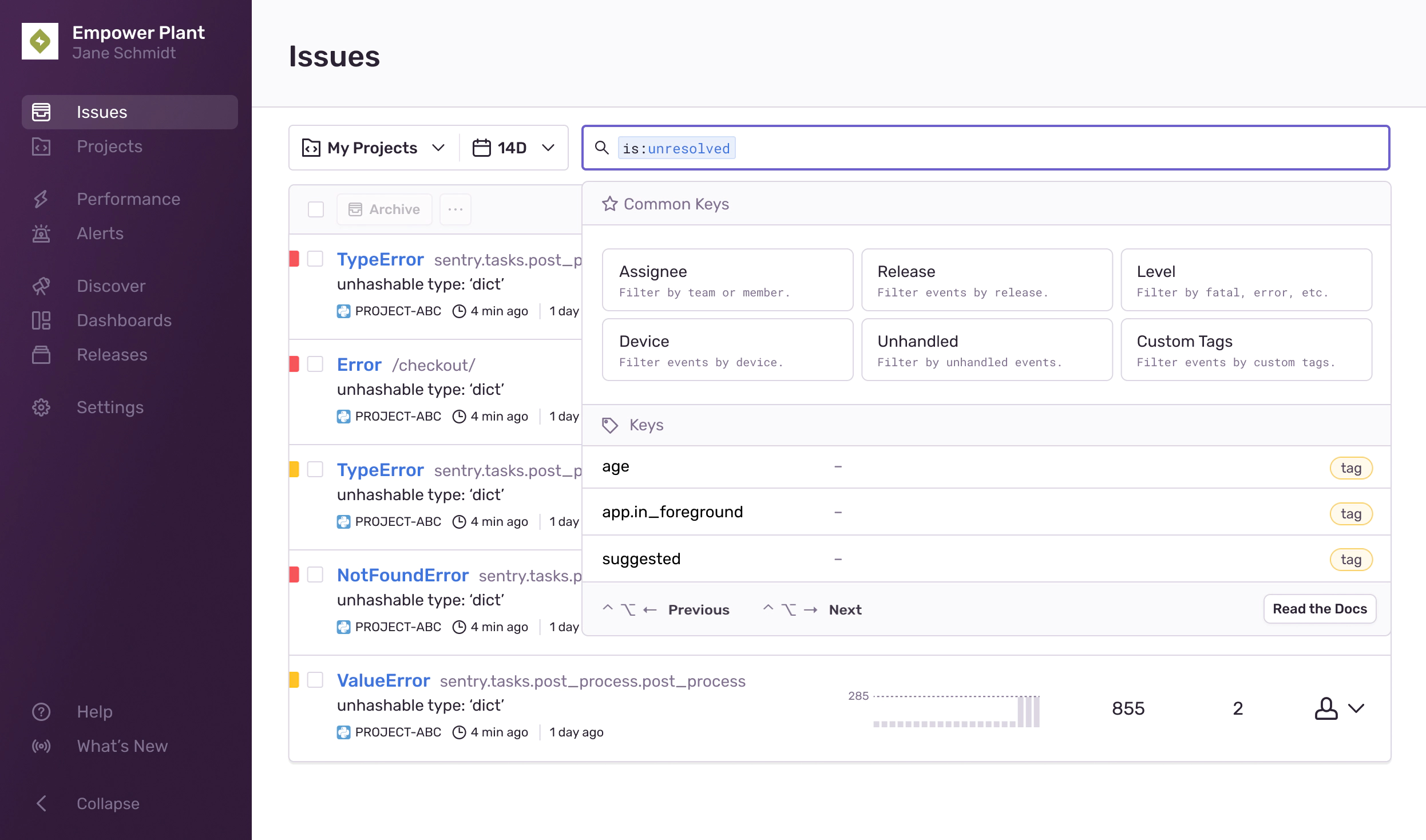
This final concept shows recommended search terms only once you’ve clicked the search bar.
More often than not I tend to see this pattern used on e-commerce websites or stores but I think it works well here. Once a customer has selected a key, like assignee or release, we could then show the most relevant value like me or Latest release. That way we could greatly reduce the amount of clicking and typing involved.
Another important part of this design that I pushed for was making sure that customers could search for their custom keys that they added to Sentry. These terms never showed up in the data I collected because everyone had different custom keys but it was vital for many teams to access them.