Issue Status
It’s magic when an engineer ships busted code and Sentry sends them a notification about the problem. But engineers often struggled to find relevant issues in an ocean of old bugs.
The vast majority of customers had hundreds of old issues kicking around that they weren’t investigating or resolving, sort of like an email inbox.
So it was clear that we needed to elevate critical problems to the top of their list so that an engineer could head to sentry.io and immediately see the issues that were most relevant to them. This led to discussions with engineers and brainstorming with the design team, after which I made a list of potential issue statuses that could help us do just that:

With these statuses we could elevate New, Escalating, and Regressed issues in some way and then push Ongoing and older issues to the bottom of their list.
I also worked on a single action—Archive—that would dismiss an issue and clean up their list. This led to several brainstorming sessions where I realized we also needed to alert customers when those archived issues escalated or got significantly worse in a short period of time.
I made a diagram showing the issue lifecycle in this brave new world:

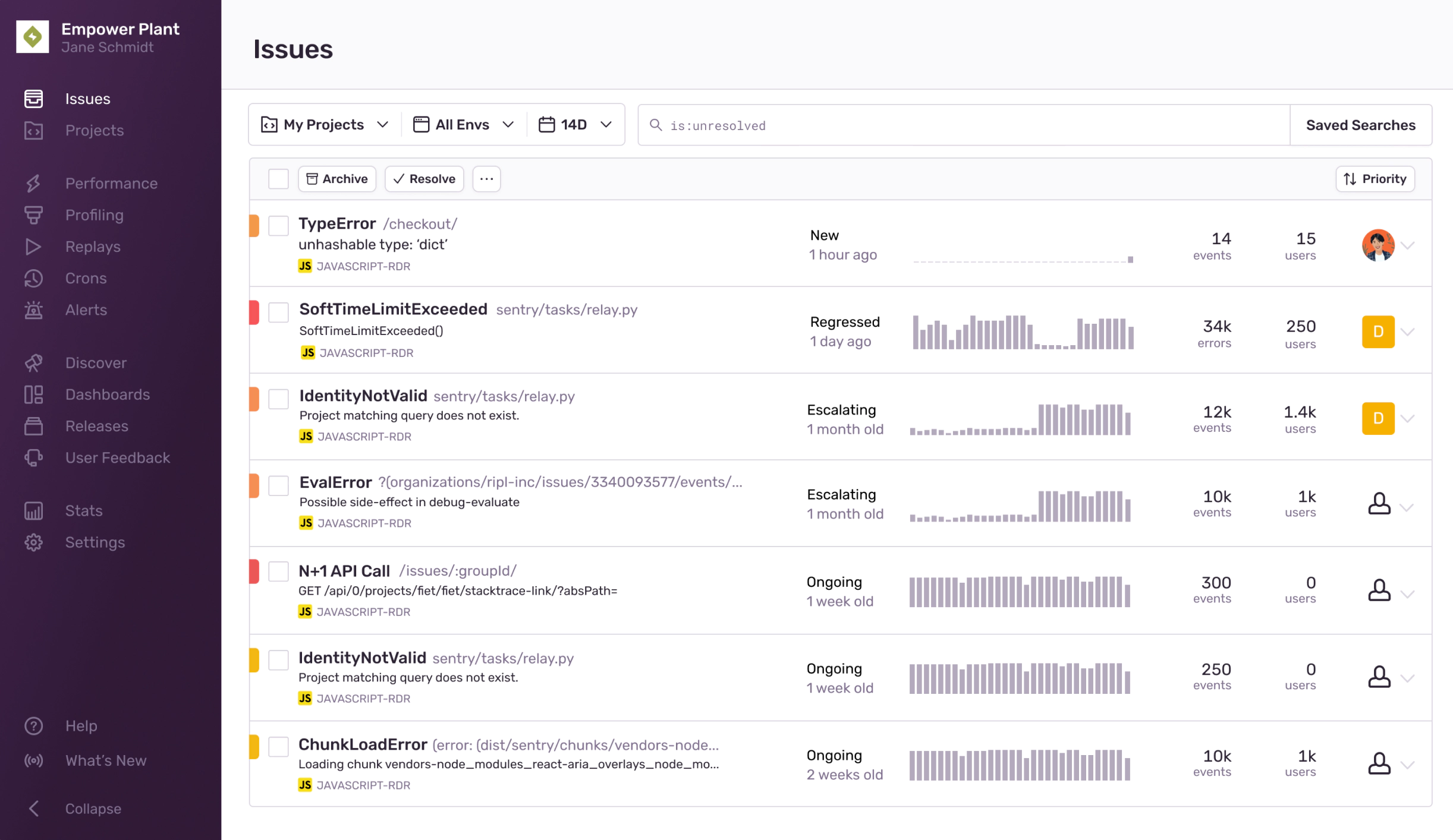
From here I could experiment with how we might represent these statuses in the app. In the first concept below, I explored how these statuses could work together into a concept called Severity. Ongoing issues would be marked as less severe and be pushed to the bottom.
I really wanted to make an interface that didn’t require clicking or scrolling or hunting for issues at all.
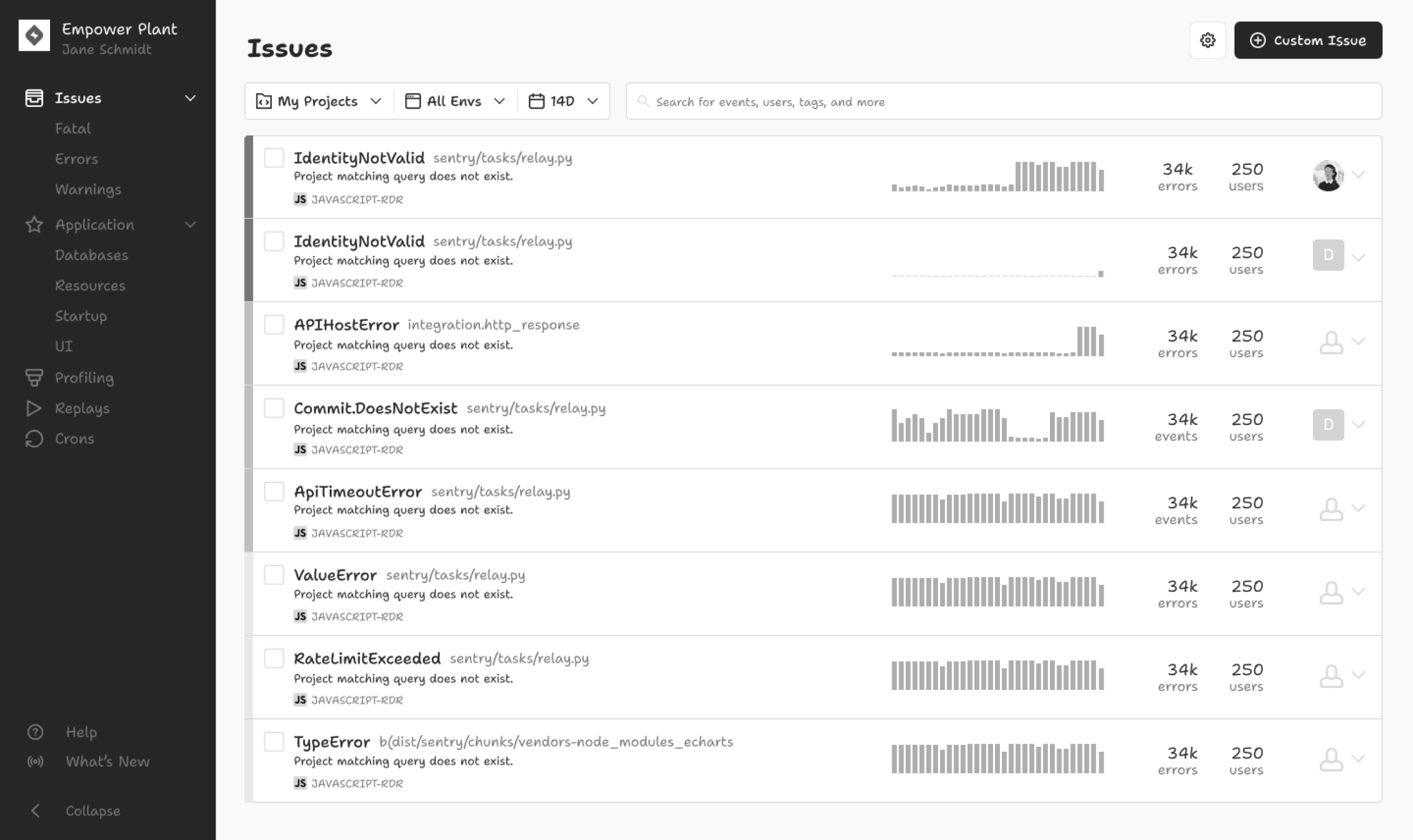
But what if engineers wanted to quickly filter the whole page by the status? I heard a lot about how engineers often cared about new issues in their latest release first—and that’s the primary use case of Sentry. I wanted developers to feel like they could trust Sentry to show them brand new problems right away so they could feel confident that a release was “safe.”
In the concepts below, I tried to optimize for that feeling:
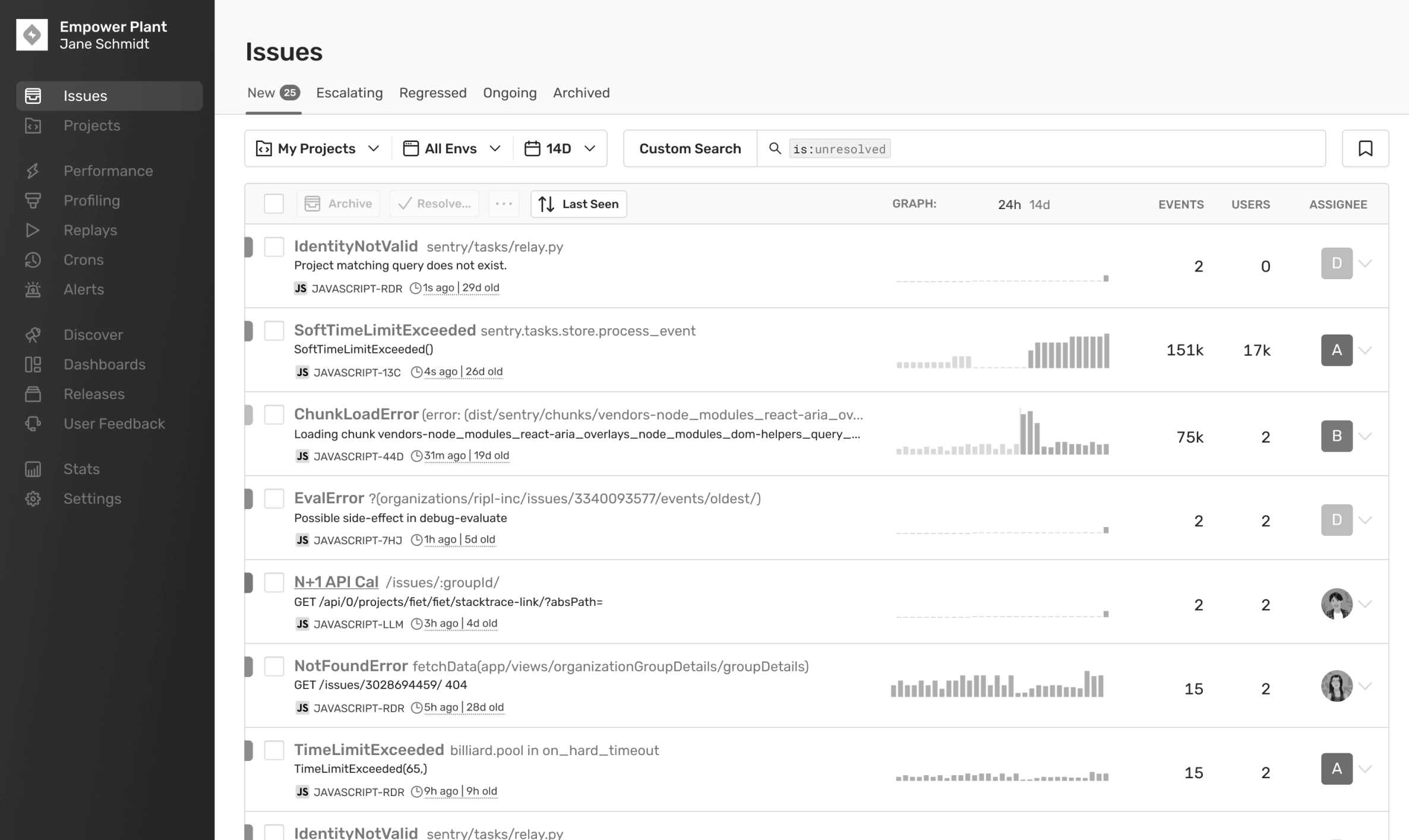
But this would involve too much darn clicking! And, as an engineer, I don’t want to hunt for Escalating issues if they’re important and I need to see them right away. Tabs were a no-go then.
The final concept was much simpler, labelling the issues by status first since fixing the sort could be part of a much larger project in the future. And considering this was the most important page in the product, we wanted to roll out a small batch of changes to be safe.
This design also increased the time period to show events in the last 14 days instead of the last 7. The idea here being that now engineers would be able to see patterns in the data much more clearly over a longer time period.
By the time I left Sentry, engineers had started work on building out the rather complicated Escalating status since the whole design rested on detecting anomalies in these patterns. I also imagined that, in the future, this could play into improving notifications. A lot of Sentry customers viewed issue notifications directly in Slack or email and these statuses could decrease the number of noisy notifications they received, in the hope of only alerting them of the critical problems in their code.