Dark Mode
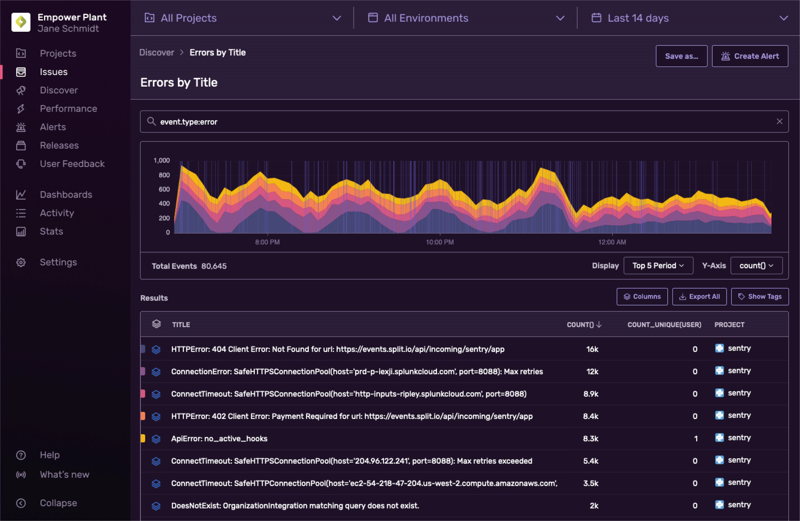
Dark mode is a fad, sure, but a useful one. What started as a hack week project at Sentry became a major effort to consolidate inconsistencies with our components and fix accessibility problems across our design system.
This project began when I was spelunking around our codebase, where I found a spaghetti-mess of color inconsistencies; scattered hex codes and one-off variables such as blueLightest or offWhite2. This greatly impacted our ability to build things quickly, as we were forced to think way too long about which variables to use.
After gathering our most common components together in Figma, we found a bunch of inconsistencies in our text and form styles, as well as how we applied border colors to our components. And so by unifying all these visual inconsistencies we could improve the interface for both light and dark mode at the same time.
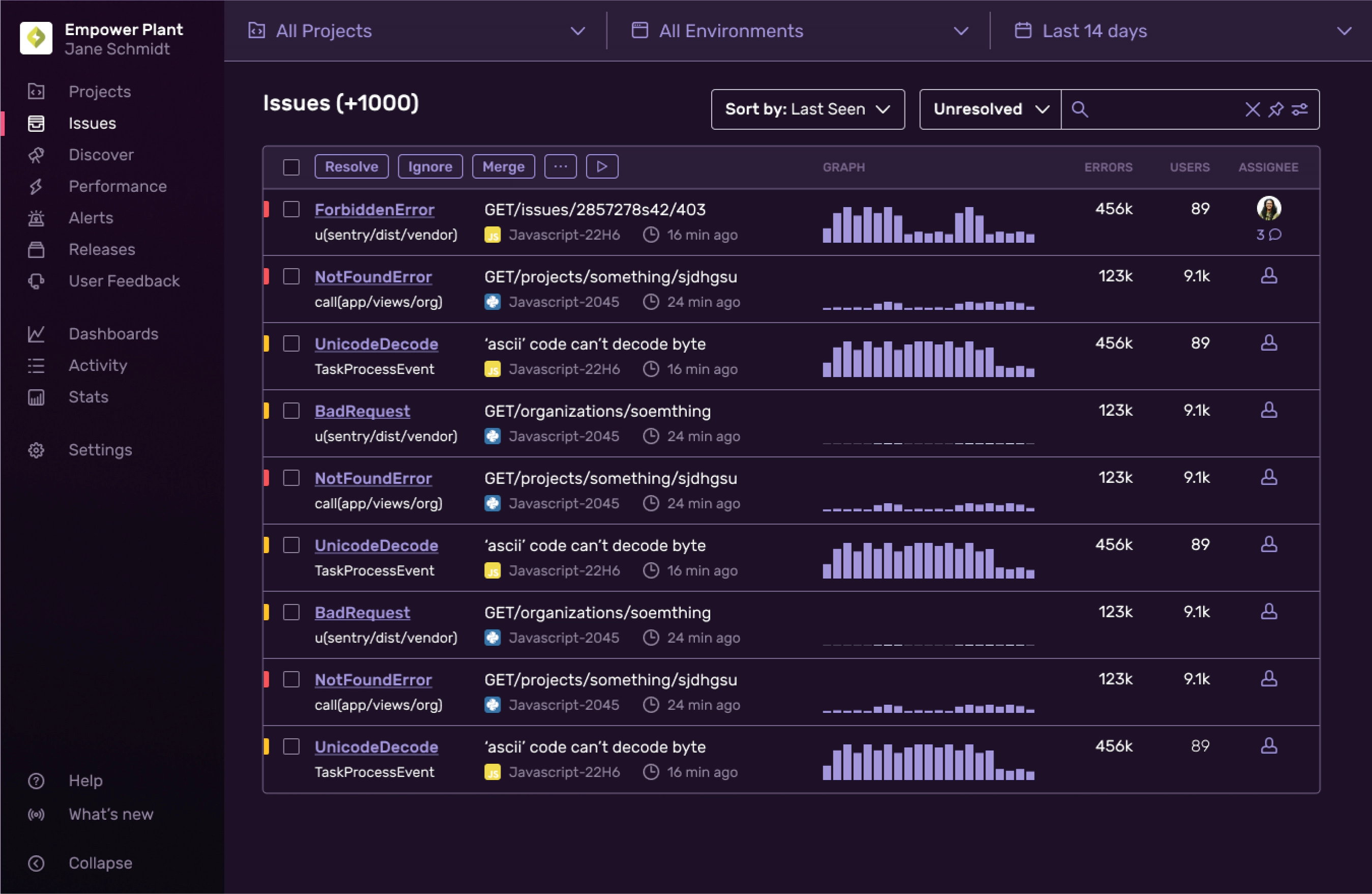
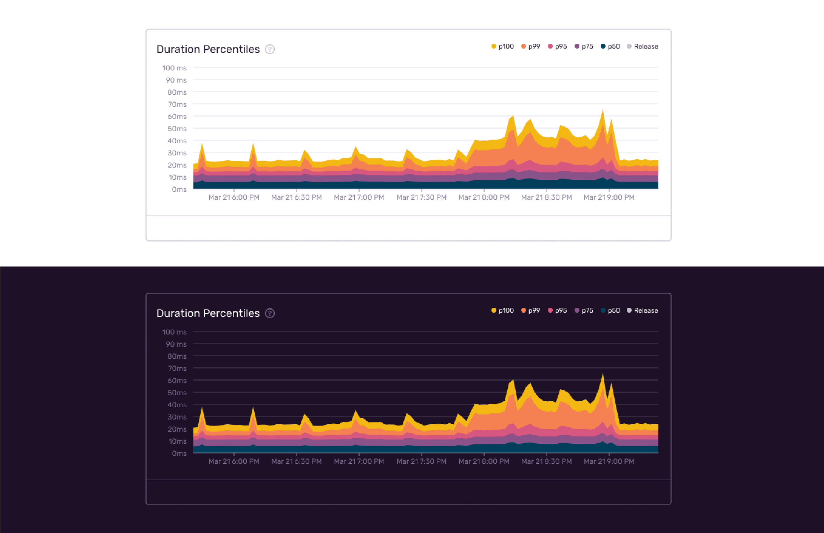
At the end of our hackweek project we shipped dark mode to customers, but the real improvement here was all the fixes we made to our components along the way. Whenever an engineer had to make a new component or select a color they’d now be greeted with a system that was accessible and easy to understand.
Read more about how we built dark mode on the Sentry blog.