Alerts
Sentry customers wanted to detect specific problems with their applications; from a slow checkout page to a crash on mobile devices and everything in between. The Alerts feature made that possible.
I joined Sentry part way through this project, as the feature was being slowly rolled out to early batches of customers. But there were a lot of confusion about the setup process for an alert and it was difficult to know what to fix once an alert had been triggered.
There were three places to look into improving here: the alerts homepage, the onboarding experience, and the alert details page.
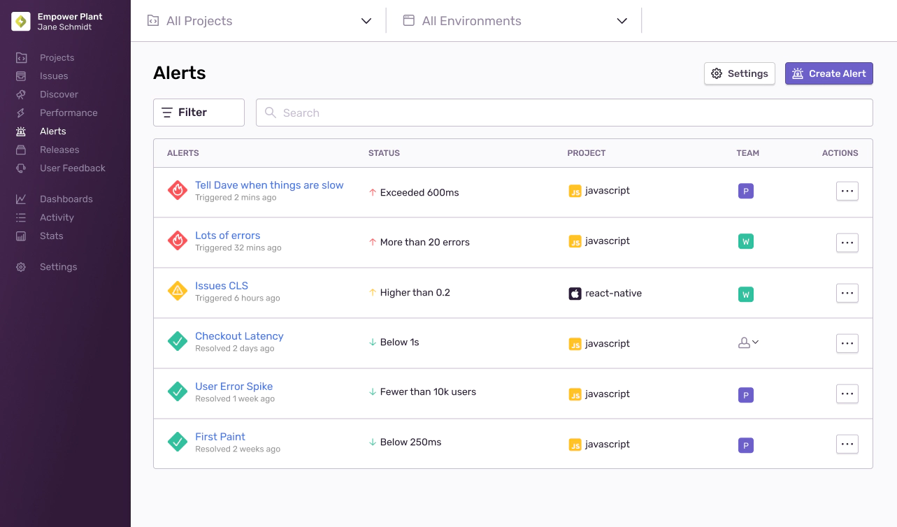
I talked to customers who mentioned that they had to click a tab and scroll around to find the alert rule that was relevant to them and might have been triggered lately. So, after a few concepts, we quickly rolled out an improved homepage that immediately tells customers what’s on fire and by how much.
I explored simplifying the interface, fixing the sort, and allowing engineers to filter this page by team:
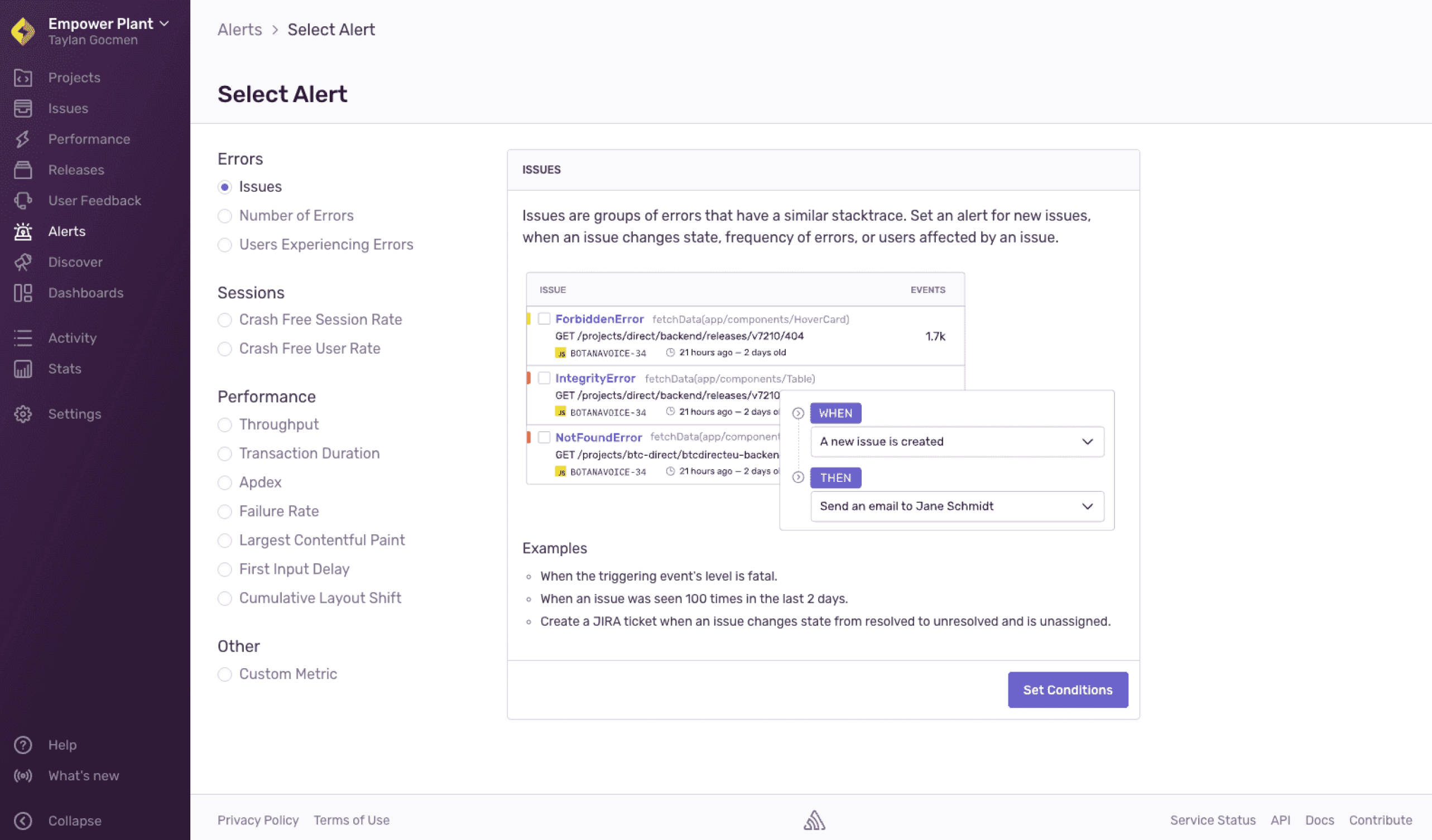
Next, I wanted to tackle onboarding. This would be a much trickier problem because I had to investigate the kinds of problems that engineers wanted to detect. And it was around this time I realized that a lot of engineers didn’t know what kinds of alerts to create — is a bad LCP score worse than a spike in the number of users affected by a problem? If I saw an abbreviation like LCP or CLS then I’d likely close all my tabs and proceed to hurl my laptop into the ocean.
So as engineers were creating alerts they needed a guide.
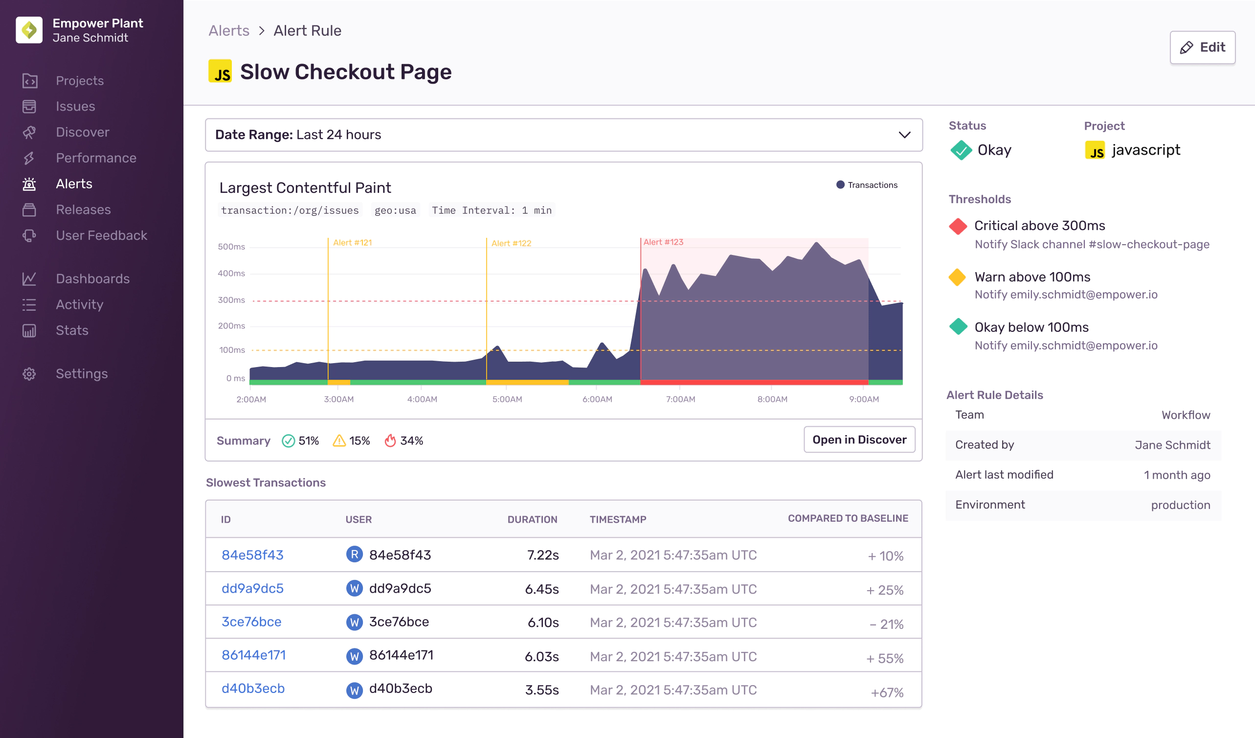
Now do we show customers that something is a problem right away? I realized it wasn’t good enough that Sentry just tell folks that their alert has been triggered but we needed to clearly explain what had broken and why. This led to us showing folks what caused the problem when all hell broke loose.
This project gave engineers the tools they need to see if their checkout page was down or their feature had caused a serious performance problem. But what it taught me was that we needed less customization ultimately and more automated tooling.