Strawberries and Cheese
The scene opens onto a gloriously dark and grimy café where my father and I have taken refuge from the storm that hovers above; clouds snap and crackle, a gale shudders along the windows whilst trees distort themselves into torturous yoga poses across the street. Inside the café, we’re welcomed with bad coffee and sweaty toast in what must be the guiltiest of Great British pleasures.
My father looks at me, and without a word, asks me why I’m upset. What’s with this peculiar frown? he wonders silently. But this is a complicated frown, I want to reply. It has nothing to do with the food, or the weather. Instead it has everything to do with the ghastly letters of the café, letters that do their best to haunt me; the misshapen logo above the entrance, the misaligned columns of text on the menu, the posters tacked to the wall, the leaflets, the business cards, the hodgepodge of shape and color all around me, everywhere.
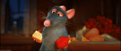
It wasn’t long before my father and I begin to reenact the scene from Ratatouille in which the protagonist, the lovable rat chef Remy, is describing his culinary interests to his brother Emile. Remy begs Emile to experiment with food, to combine the cheese and the strawberry before in order to understand what’s available to them, and yet Emile can only dimly sense the difference between cheese, strawberries and any other form of garbage that happens to pass through his digestive system.
The question that consumes every moment of Remy's time is a simple one: how do we learn to taste?
The same must be said for typography: by training the eye we learn how to see. We become aware of the aesthetic and functional problems of letterforms, problems that are sometimes frivolous but at other times are essential to guide the act of reading. Whenever I hear talk like “we have too many fonts” or whenever I watch someone stare at me when I gawp at bundle of letters, I want to call out: “Strawberries and cheese! Strawberries and cheese!”
Despite those typographic disfigurements in the cafe that bleak afternoon, I wanted to explain how letters can reward the eye with a form of pleasure which is hard to describe. So I want to offer a brief respite from those casual typographic horrors we encounter with a newsletter. It is here, in the Adventures of Typography, where we shall be safe from the wind and the rain, and from all the ugly letters.
It is here that we shall celebrate the strawberries and the cheese of typography.