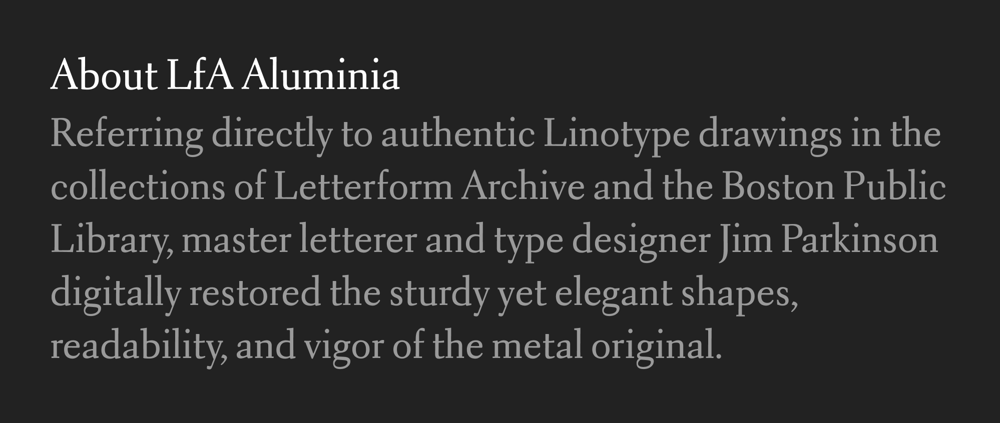
LfA Aluminia
By some cruel fate and in a long running conspiracy involving secret foreign governments and spies, not to mention the tens of millions of dollars of shady private funding that has been poured into this network of deception...something something something...I somehow missed the release of LfA Aluminia, a typeface designed by Jim Parkinson and published by the Letterform Archive back in 2017.
It was a conspiracy I tell ya because just look at this thing!
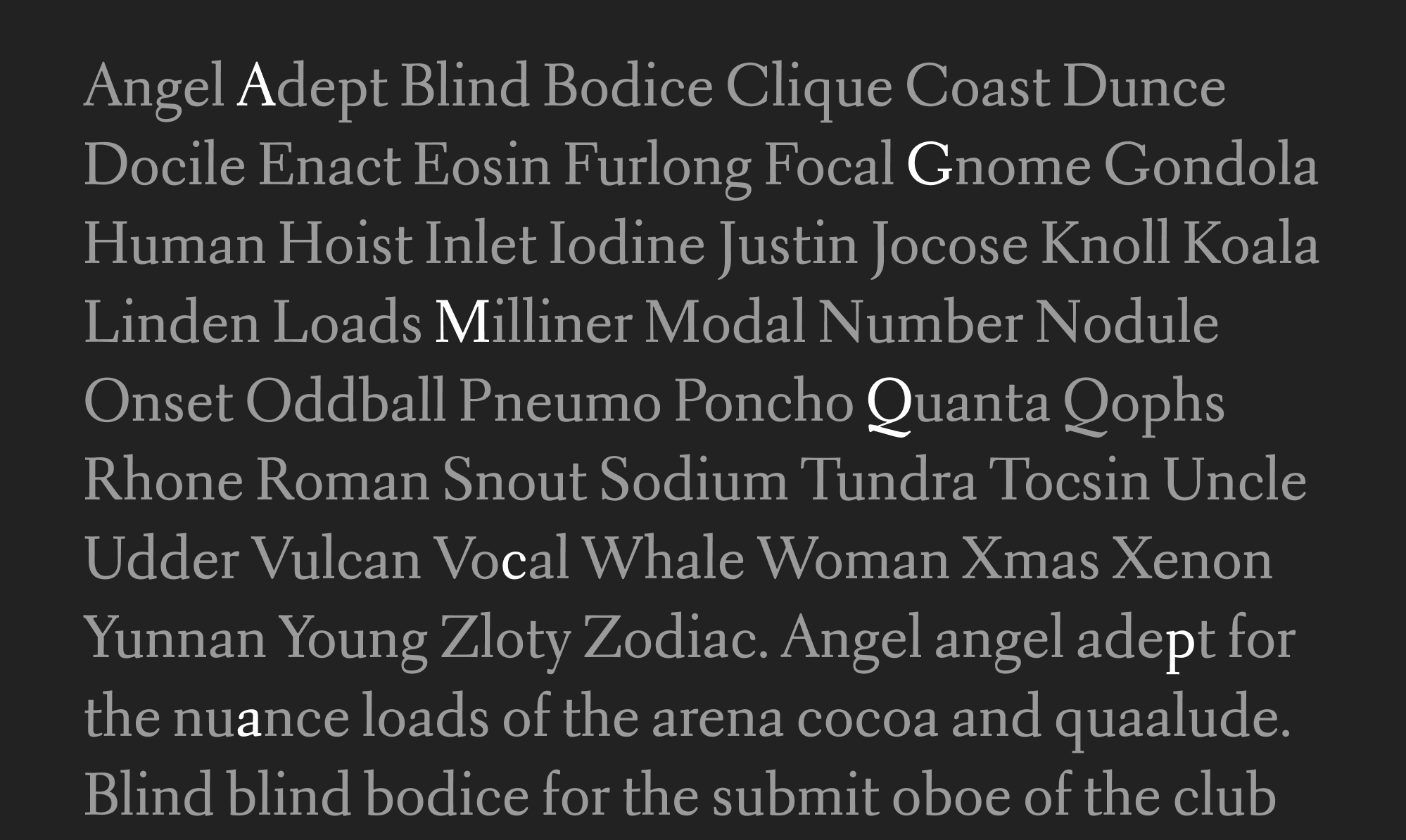
I love the squarish-ness of it, the way that it all looks like an italic from a distance. I love its New-Yorker-I-am-wearing-a-bowler-hat-and-having-a-great-time sort of vibe. I like the difference in height between the capital letters and the x-height, its almost-Chaparral look. Okay, okay. I’ll admit it; I love it all.
The type family—Roman, italic, small caps, and oblique—is based on the 1930s metal type family Electra, designed by W.A.Dwiggins. And there’s a great interview with the designer Jim Parkinson about how he interpreted those old designs. But! The Letterform Archive folks also took a bit from Dwiggins’s specimen of Electra in the 1930s where the designer is asking someone what the new century of type design will feel like:
“Electricity” he said, “sparks, energy — high-speed steel — metal shavings coming off a lathe — precise, positive — say it with a snap.” I waited to see if he would get closer to something that I could use. “Take your curves and stream-line ’em. Make a line of letters so full of energy that it can’t wait to get to the end of the measure. My God — these Lino machines that you tell me about — what kind of letters would they spit out if you left it to them? 1500 Venetian? Not!”
Anyway, I got so excited about this that I switched out the body text here with Aluminia, too. Does it pair well with Ayer as the headline? Mmmmmm... maybe not so much. But I sort of like how everything is extremely wonky right now. I think if I paired Aluminia with something less weird than Ayer than it could push the scales too far in the direction of the New Yorker and make my writing feel a bit pompous perhaps? Yeah.
Although...the flash of text is now somewhat worse, and it was pretty bad before this change. I’ll fix that at a later point as I probably have to rethink my whole font loading strategy.