Colorful Headings
Good morning! One small tip for your Monday morning typographic perambulations: I think we should always make headings darker than the body text. It’s a small change but it has a significant impact on longer chunks of text and is especially useful if you’re typesetting both headings and body text with the same typeface. Here’s an example:
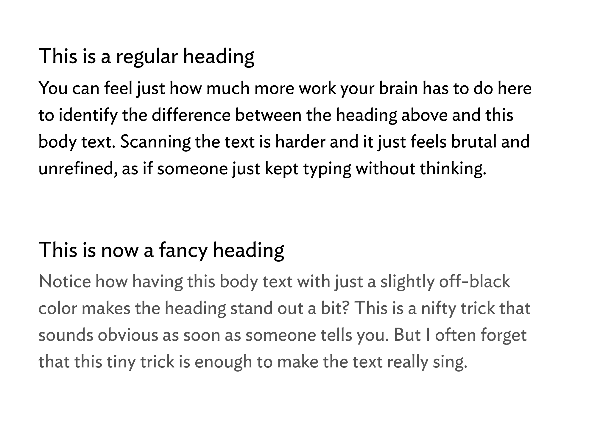
Isn’t that so much better? It’s not typographically ingenius or anything but it does improve the overall shape of the text. And it makes you understand the relationship between these two different types of text much faster. Now imagine this in a book or on a website with all sorts of other information that your brain has to decode and this starts to become even more useful.
It also ties into my favorite thing to keep in mind when designing something: focus on the difference between differences. That’s a clunky way of saying “when something is different, make it look different.” The best designers, in my opinion, take this to heart and don’t use too many variants to make those differences as clear as possible.
You don’t need giant gradients and icons, you don’t need a million fonts (although we should experiment with as much of this stuff as we can). We can do everything we need to accomplish, at least here and in this one example, with just two colors and two text sizes.