The Futures of Typography
Typesetting on the web has evolved from a quirky afterthought into an invaluable practice. Within a span of twenty years complex interfaces that adapt to their environment, as well as an overwhelming number of typefaces, have bloomed all around us. Likewise, using animations and transitions or balancing display text in conjunction with powerful OpenType features became not only possible but expected. So where do we go from here? What are the skills we need to contribute to the future of typography? And what do two ghostly figures from the 15th century have to do with that future?
1452 was a year of witch hunts and plague. Wild bandits were spreading chaos throughout Europe whilst medicine, transportation and science had been in stasis for almost a millennium. But throughout all of this despair there was a glimmer of hope in the German town of Mainz. It was here that a debt-riddled printer with the enviable name Johannes Gensfleisch zur Laden zum Gutenberg had been tirelessly working on his latest project.
It was a book.
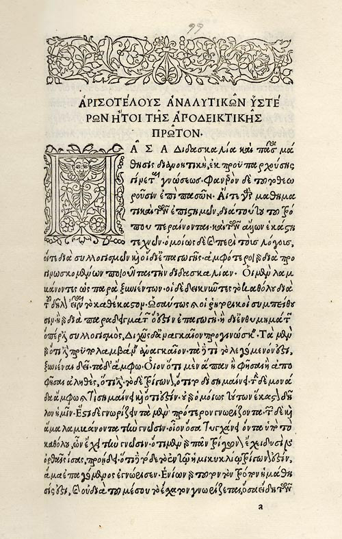
Although it was not just any book, it was a Bible; considerable in weight and breadth. It was the first book to be made with movable type[1] and so it was the first to abandon the scribal tradition where books were written by hand. That doesn’t mean Gutenberg’s workshop was a particularly nice place though – it would likely have been a dark, smelly[2] and cramped room. Nonetheless, a true wonder was being cut, inked, illuminated into life and it’s here that Gutenberg invented what we now consider bookish objects to be.
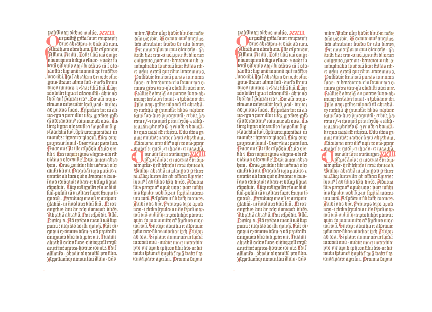
However, Gutenberg’s Bible is wildly different to the books that we read today and if we take a closer look at the texts themselves then we’ll find a more complex history at work. First, many of the editions of his Bible were printed on vellum[3] (which is a material made from calf-skin). Secondly, the book was enormous and would require serious exercise[4] to simply move the tome from one room to another. Its insides are also strange – for example, when a copy is wrenched open, two monolithic columns of Latin text can be found stretching across each page.
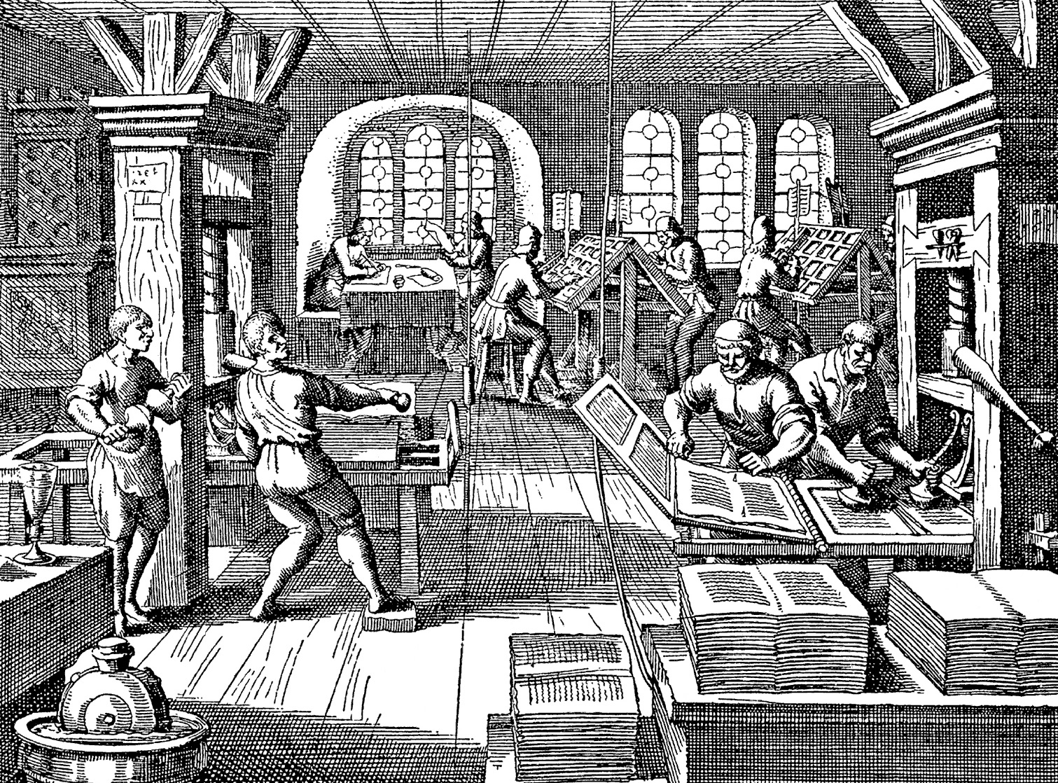
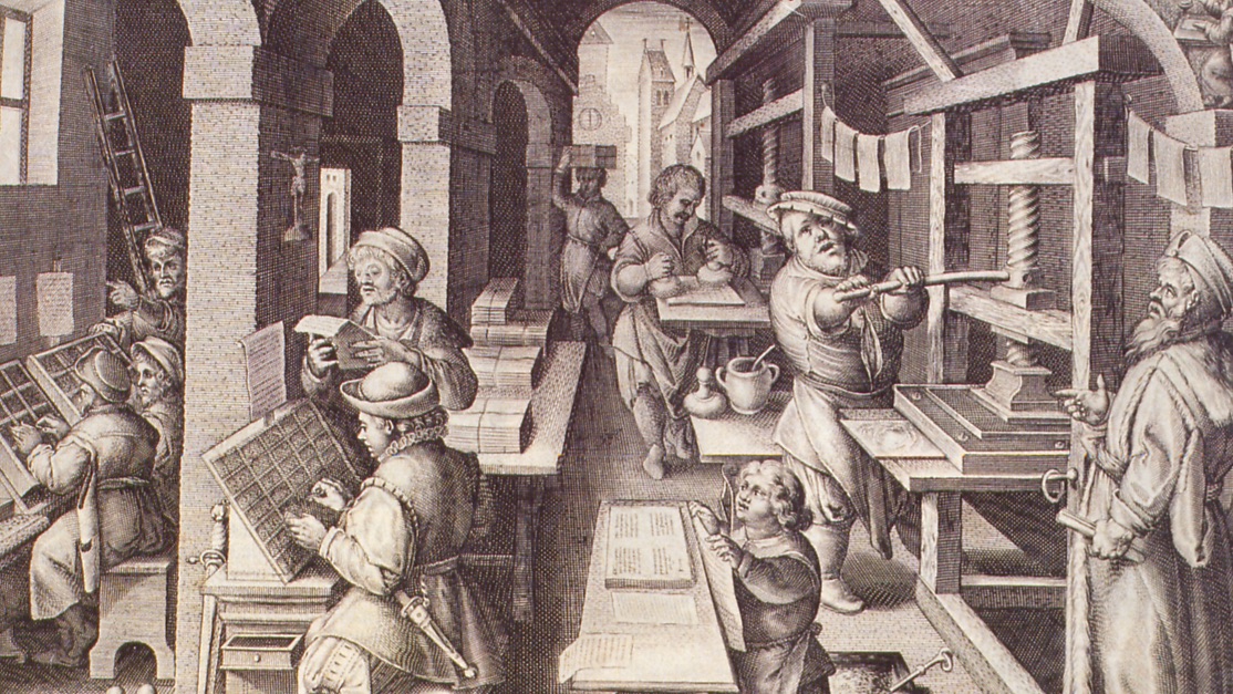
How did Gutenberg and his printshop create these peculiar letterforms with metal? Well, from court documents in the years leading up to the printing of this 42-line Bible there’s mention of a secret machine which Gutenberg had destroyed before his debtors could take hold of it. Printing in the 15th century was a clandestine activity and if anyone discovered Gutenberg’s process then he feared he’d lose everything. This might also explain why we have such a fragmented history[5] of Johannes and his workshop.
Regardless of this startling lack of evidence, we know that Gutenberg combined preexisting technologies alongside creating his own tools.[6] There were three crucial parts to his workshop’s cloak and dagger process: the counterpunch and matrix, the type mould and the printing press.[7]
1. Counterpunch and matrix
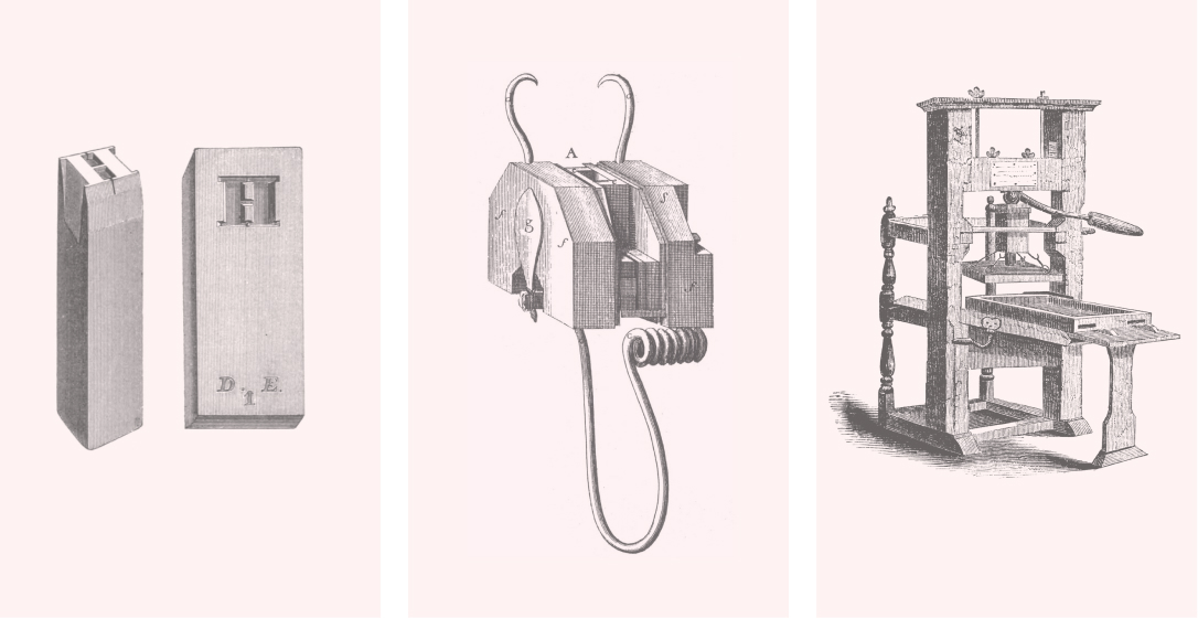
A tiny bar of metal known as a counterpunch would be shaped with a knife until it resembled a letter, but in reverse. A highly skilled punchcutter could take up to a day or more making a single punch depending on its complexity and size. But afterwards, it would then be pressed firmly into another bar of metal called a matrix in which the shape would be ready for the type mould. Source
2. Type mould
The matrix would be locked into the type mould and molten metal would be poured into the top. Once cool, the printer would open the mould and find an exact replica of the original letter inside. And because each page is likely to need more than one particular letter, they would have to make an awful lot of them; the faster they could duplicate a letter then the faster they could set the text.
3. Printing press
A whole alphabet cast from the mould would be set to form sentences and paragraphs on a tray and then ink would be dabbed across the surface before the paper is pressed down with a turn of the lever. Shown above is Benjamin Franklin’s press and I only include it here because it’s shocking to me just how similar this is to a sketch by Albrecht Dürer made in 1511.
Whereas the counterpunch had been inspired by the work of goldsmiths and the idea of a printing press was most likely borrowed from vineyards, it was the type mould that became Gutenberg’s true innovation. And it was an important tool to keep secret because it might take about a year to make an alphabet of metal type but those shapes could then be easily reproduced in the mould. Think of it this way: the type mould was a little cloning machine, and once Gutenberg had made multiple copies of every letter then he could effectively print a book for a fraction of the cost.
Throughout this engineering and cultural synthesis there was one particular goal in mind:
Fred Smeijers, Counterpunch, pp.43[Gutenberg’s] ideal would have been to make type indistinguishable from formal writing. So the goal of typography at first had nothing to do with type or design: it had everything to do with saving time. Producing multiple copies of books faster than they could be written was the point of typography: no more and no less.
It seems that Gutenberg saw the future of typography as replicating the same format and design[8] of the monastic scribes, except speeding up the process in between. The choice of letterform, the size of the book, its margins, they were the result of looking at previous examples made by scribes and copying each and every bit. So even with these tools available to them, Gutenberg and his staff weren’t capable of bringing books out of the medieval world and into the Renaissance where they truly belonged. But what if setting type with metal was an entirely separate discipline from making a book by hand? What if the book could be reinvented for a new era? This act of treason would take about fifty years to spread, but in 1452 it had already begun. Whilst Gutenberg was developing his press in Mainz another very important character in this story was born five hundred miles to the south in the Italian province of Lazio; Aldus Pius Manutius.
About fifty years later, at the turn of the 16th century, Gutenberg’s covert method of printing had leaked and spread all across Europe – by the time that Manutius was an adult almost twenty million books had been printed. Much like Gutenberg, he had grown up in a wealthy household where he had a formal education consisting of Ancient Greek,[9] his favorite language, and Latin. This love of literature and books led to a scholarly life where he comfortably taught princes, but at some point Aldus abandoned his employment and moved to the cultural and commercial hub of Venice where he would jump head first into the ruthless trade of printing.
Manutius had moved to Venice and started his own printshop because his admiration for literature was unquestionable. He believed that books were more than a commodity or an art project – they could also archive and preserve information for the future. In fact, the collector Scott Clemons[10] argued that Aldus Manutius and his Aldine Press were a sort of modern day archive.org:
Scott Clemons, How Aldus Manutius Saved CivilizationI am haunted by a particular counter-factual history. Namely, a history in which Aldus never existed. […] I think the world would be an immeasurably poorer place had not the right man, Aldus Manutius, been in the right place, Venice, […] at the right time, the fifteenth century.
Thanks to the Aldine Press printing ancient Greek works in their original language, texts that were previously only available in fragile manuscripts were now more likely to survive. And by printing several hundred copies the press could recirculate those ideas and ensure that they were less susceptible to being lost from the historical record. But this belief in preservation was complimented by Aldus’ belief that the reader should no longer be bound to a desk in order to read a book. If they could only be printed in a smaller format, Aldus reasoned,[11] then they could fit into a reader’s pocket and travel with them wherever they go.
The Aldine Press then began to favor a new format for the book, the Octavo, which was considerably smaller.
I think Aldus recognized the potential of bookmaking since it’s clear that his team challenged the format of the book and in the process they questioned what a book could really be. They certainly appreciated the beauty of the medium too, but they were far more willing to compromise its aesthetics for the sake of mobility and keeping the printshop running. In other words, the aim of typography for Aldus and the Aldine Press was to preserve culture and knowledge, to contribute to the growth of literature and ultimately build a library without walls.[12]
Books, Tables and Time Travel
Whenever I think of Johannes Gutenberg and Aldus Manutius I think of them together, sat at a table, with their books open before them. They’re criticizing each other’s work. From one end of the table Aldus silently judges the weight of Gutenberg’s Bible whilst Johannes smirks and flips through an Aldine octavo at the other. In this fictional meeting there’s an argument brewing between the two of them: what is the future of book design and what are the goals of typography? Beauty, or accessibility?
But let’s imagine another table for a moment.
On it we’ll place all of the devices and browsers available today until it’s somehow possible for us to view every website imaginable. Considering this thought breaks the laws of both space and time, we’ll go ahead and break them again: at the other end of this impossibly long table we’ll place all the networked devices that might be available fifty years in the future, too. How much has changed? What do we see? What sort of questions would we like to ask of a time-traveling typographer?
Well, here’s what I would ask: what is the future of typography? And what does the web have in store for us? It’s easy to think of the latest trends in virtual and augmented reality, or drone typography, or to discuss how flat design might conquer the world. What I’m really interested in though are the technologies and ideas that are likely to stick around for the long term. Which tools should we be looking out for that will change how we set type on the web and how do we keep those Aldine principles of typography in mind?
However, before we attempt to answer these questions we first have to acknowledge a rather serious problem with the web: the web hates beautiful typography.
Justification and the ability to handle orphans and widows, complex grid systems and simple baseline grids; to bring these attributes of print onto the web is difficult work and we need a lot of JavaScript to parse the text and clean it up. They’re typographic embellishments that printers have enjoyed for centuries, so how can the web not have caught up yet?[13] What’s taking so long? And why does the web hate beautiful typography?
There are some good reasons for these frustrations and limits, but I think that obsessing over them is leaning too far much into the Gutenberg spectrum of typography for my liking. Some of these features will land in browsers, and it requires a lot of patience to wait for them, but perfect control over web typography (and making interfaces that are pixel-perfect) is an adventure that will only lead to heartbreak and madness[14]. In fact, fighting the limits of web typography with a thousand lines of JavaScript used to be heroic, or so I believed. But now I think that we ought to make compromises in our designs because as typographers our job is not to make a beautiful interface with the most elegant typesetting imaginable; I think that before we can make typography beautiful we must first make it resilient.[15]
Primarily this means ensuring that the network doesn’t get in between our text and the reader.
Here’s one example: a core problem with a website is that it’s entirely dependent on the network in order for reading to begin. Regardless of whether we’ve just viewed a webpage or not, our browsers will constantly try to fetch new data and if there isn’t a reliable signal then the text will simply not appear.
Thankfully, a new API called ServiceWorker is here to help tackle this problem. It gives designers the ability to cache parts of a webpage, like images, fonts, and the text, so that when a reader comes back they can pickup where they stopped reading even if they’re offline. They’ll still need a network the first time but the reading experience is ever so slightly more resilient for the future[16]. In fact, this very website uses ServiceWorker and if you go into Airplane mode or switch off the network and then refresh this page you should still be able to see the text as if you were online, so long as your browser supports it.[17]
Building a resilient, future-proof typographic system for the web encourages us to prioritize weaknesses[18] that can be found in the network. But our future typography will also require us to rethink how we view the act of reading itself – reading is a complicated business and people scan the text in a variety of different circumstances, no longer do we expect to be sitting perfectly still in a dark and gloomy monastery. So how do we know if a particular technology, like a ServiceWorker, is really improving the user experience if we don’t know much about the act of reading itself?
The typographer and teacher Indra Kupferschmid[19] once split readers up into two separate types: motivated and unmotivated. It’s useful to think about readers like this because whenever we’re setting type we need to be asking ourselves whether it’s worth implementing a feature in the first place. If our readers are motivated to finish the text then we probably don’t need fancy animations or big display text. Alternatively, if a reader is unmotivated then the text should stand up as tall as possible and scream with all its might.
Unmotivated reader
- Short, selective reading
- Non-essential content
Advertising, logos, posters and packaging
Motivated reader
- Long, immersive reading
- Crucial content
Novels, news, correspondence and signage
Which of these two readers are we designing for? Is the reader familiar with the ideas being presented? Are they likely to read more about the product or service? How do we encourage the right type of reading? And how much information is vital, how much is superfluous? Our future typography will have to cater to both of these groups of readers.
But for all future readers, there are two separate font technologies that have started to gain traction in browsers lately: variable and color fonts. And I believe that they signal an interesting shift in typesetting on the web. To begin, variable fonts aim to vastly improve web performance and give designers a motley of typographic choices.[20] So instead of downloading each specific webfont one-by-one as we do now, with a variable font we can download a single file. This means that in the near future our browsers will interpolate all the values in between bold and regular weights, or thin and condensed widths, and present us with an infinite combination of styles in between.

Roel Nieskens, Variable Fonts: the Future of (Web) TypeWe’ll be able to use a much wider range of widths and styles with impunity. Where previously we had to refrain from using lots of different weights to avoid long download times and performance hiccups, soon we’ll be able to all but disregard such technical details in our decision-making. Creativity, not technical limitations, will guide font choice.
For readers of languages with Latin alphabets (like English, French and Italian), variable fonts provide them with a boost in performance because they won’t have to download multiple fonts to see complex typography. And for many designers, they’ll provide a more subtle tool for typesetting. But for readers of the web in other languages, variable typography will actually make webfonts a viable reality for the first time. This is because for complex languages the font files can be gigantic when compared to a Latin based language.[21] For those readers, this technology is not just about meagre improvements to performance, but instead variable fonts will give them access to the sort of typography that we’ve taken for granted.
Whilst variable fonts is really an improvement to the OpenType specification, the other technology that I would like to discuss – color fonts – is a new font format altogether: OpenType-SVG. This format gives us the ability to jump inside the glyphs of a typeface and paint them with multiple colors instead of the single color fill that we’re currently limited to. Because for now we can only add a single color to all parts of the glyph, this greatly limits a typographer’s ability to express an idea with text.
See how the typeface[22] above has two shades, one light and one dark? That’s an example of the color font Trajan Pro which has a variety of options to manipulate parts of the glyph inside.
But how far will color fonts really change typesetting on the web? Not much, I think. However, although it doesn’t look particularly impressive now, this is a small step towards giving us control over the glyphs inside a font – it will help us capture attention and make display text more persuasive, especially once other type designers start experimenting with this technology, too. How is this useful for the future though? I’m starting to believe that it challenges our concept of what display text is capable of, or how we see individual glyphs in a word, and sometimes a technology isn’t useful for its utility but for the way that it challenges how we think.
The last improvement I want to briefly discuss here is called Grid Layout,[23] which is an addition to the CSS spec and it promises an exciting future for laying out text on a webpage; setting columns, aligning objects and changing the position of an element on the screen without changing the source order in the markup are only a few of the possibilities it grants us.[24] This will likely have a great influence on our design and development process but for the first time in the history of web development it will finally be possible to make complex layouts without having to resort to a series of hacks.
When seen as separate, disparate technologies the few upgrades I’ve mentioned above don’t seem all that impressive. But when the ServiceWorker API, new font formats, and Grid Layout are brought together the web is suddenly very different to the one that we experience today. They dramatically impact both motivated and unmotivated readers whilst making the web more resilient to the changing winds of a patchy network connection. But even with these technologies that I’ve mentioned above, the web will always be a wild and finicky canvas for us to work with; we’ll have to be creative in the ways that we help older browsers that don’t support these features. So although I don’t believe that the web hates beautiful typography, there certainly is a tension between the web and the old typography, where control over every element on the page was relatively easy and absolute.
Yet there are more serious problems than whether everything on the page is in perfect alignment and brought together in harmony with the most delightful ratio.[25] What about those questions that Aldus and his Aldine Press asked of us?
What about accessibility and the preservation of the text? Making sure that everyone can simply read the text in every browser is more important than just about any typographic flourish that we can implement. And so with that in mind, whenever we stumble over a new feature for the web we have to question whether it will truly improve the reading experience.
Subsequently, if we focus on those two readers that Indra mentioned then we ensure that we don’t become too cynical or dogmatic[26] about crazy new features that might impact typesetting on the web. In the past I’ve seen many experienced typographers dismiss new features that browsers afford them, only for those technologies to become a vital part of what typography now means on the web. So I think there’s a constant risk of assuming that typography will always work in a familiar way; challenging what we know about typography is the first step to contributing to its future.
That’s the most beautiful and interesting part about the future of typography – that there isn’t one future, but many. We can synthesize conflicting technologies, and previous typesetting methods, or we can listen to the fictional arguments between two ghostly printers and imagine what might have occurred if their ideas and skills were combined together.
There are infinite futures of typography, and the opportunities only expand when new browsers, new features, new devices become available to us. All that’s required is a little patience and a healthy dose of curiosity.
About me
I’m a web designer and writer from the UK and now I live in San Francisco. I work at Sentry as a product designer and I also work with the team at CSS-Tricks where I try to figure out why browsers misbehave in the way that they do.
Special thanks to
- Tor
- Chris Coyier
- Tim Brown
- Robin Sloan
- Alphabettes
- David Jonathan Ross
- John Boardley
- Marcin Wichary
- Jez Burrows
- Keith Houston
- Jen Simmons
- Andy McMillan
- American Wrestlers
- Dora Chan
- Sarah Drasner
- Stephen Coles
- Viljami Salminen
- Geoff Graham
- Christoph Rauscher
- Donny Truong
- Zach Leatherman
- Indra Kupferschmid
- Andrew Johnson
- Chris Rendle
- Bram Stein
- Chloe Weil
- Allen Tan
- Phil Swan
- Garrett Winder
- Paulo Pereira
- Jake Giltsoff
- Nick Sherman
- Craig Mod
- Una Kravets
- Jeremy Keith
- Kenneth Ormandy
- Mandy Brown
- Robert Vinlaun
- The Arion Press
Footnotes and further reading
Gutenberg is often credited with the invention of movable type but that’s certainly not the case, as Chinese methods predated his invention by almost five hundred years. Source: Keith Houston, The Prints and the Pauper, I Love Typography ↩︎
To my horror, when I visited the American Bookbinding Museum I was told that print shops at the time would have to clean the ink off of their equipment with giant vats of urine. It can safely be said that I wouldn’t have made a particularly good book designer in the 15th century. ↩︎
In a BBC documentary about Gutenberg called The Machine that Made Us, Stephen Fry claims that it would take about 140 calves to print a single copy of Gutenberg’s Bible. I can’t find any supporting evidence for that claim but it’s horrifying to think about nonetheless. ↩︎
The 42 line Bible was designed to be read stationary, preferably sitting down in a reading room somewhere in a monastery. The book would be placed on a large desk and the reader would be forced to sort of hunch over the text. Although, this wasn’t the case for all books at the time, as Kieth Houston describes in Paper Adaptations: “All this is to say that the book has never stood still. The British Library’s 8th-century, £9m St Cuthbert Gospel may be as recognisably a book as a Gutenberg Bible or a Penguin Classic, but the book itself has been nipped and tucked and reinforced and streamlined on an ongoing basis ever since its invention.” ↩︎
Alix Christie in Gutenberg’s Bible: “Though celebrated in 15th century oral histories as the undisputed inventor of printing with movable type, Gutenberg never signed his name to a single printed book. Although his early years are well documented, virtually nothing is known of his activity in the crucial years between 1449 and 1454 — the years in which the Bible of 42 lines was produced in a workshop in Mainz.” ↩︎
Keith Houston on Gutenberg in The Prints and the Pauper: “…if Gutenberg is to be credited with anything it must be that he made it work—that aided by the comparatively economical Latin alphabet he systematically tackled each aspect of a finicky, delicate process until he had perfected it. If calligraphic ink did not meet his needs, he would look elsewhere; if embossed characters were too costly to cut individually, he would find a way to produce them in bulk; and if a firm hand was necessary to get the best impression of the printed page, he would choose tools and materials that could withstand that pressure. Johannes Gutenberg was not the father of printing so much as its midwife.” ↩︎
I’m glossing over much of the type design and printing process here but I think it’s safe to say that this is a relatively fair summary of Gutenberg’s contribution. ↩︎
Perhaps this is a little simplistic, Gutenberg and his financiers most likely knew that if they experimented too much with the form of the book then they’d never receive a return on their investment. But it’s clear from the books that an unhealthy obsession with perfection led to the creation of these objects. ↩︎
If you’d like to see more examples of books that the Aldine Press printed then the Bavarian State Library and the Munich Digitization Center has archived high quality scans of Aldus Manutius’ Aristotle. Notice the large margins and the shortened line-height. Also make sure to check out the Aldine Greek typeface that adorns the book, too. ↩︎
This quote is from How Aldus Manutius Saved Civilization by G. Scott Clemons and it’s one of my favorite talks about typography and design. ↩︎
In a letter to a friend, Aldus wrote: “We have printed, and are now publishing, the Satires of Juvenal and Persius in a very small format, so that they may more conveniently be held in the hand and learned by heart (not to speak of being read) by everyone.” via I Love Typography ↩︎
It appears this “library without walls” quote I’ve seen everywhere has been paraphrased from Erasmus’ description of Aldus, where he wrote that “Aldus is building a library which knows no walls save those of the world itself.” Source: Erasmus, Desiderius, Collected Works of Erasmus: Adages, translated and annotated by R.A.B. Mynors (University of Toronto Press, 1991) 33 Iii1 to IIvi100, p. 10. ↩︎
This links back to what Tim Brown mentions in The web is terrible for typography!: “The web is a revolutionary typographic space. It deserves special attention not because it is a new medium, but because it is the evolution of all media. Aspects of typography that we have understood for hundreds of years are now changing because of the web — changing, I believe, for the better.” ↩︎
Further contributing to that madness is assuming that all browsers work alike. In Chrome Bias (and Finding Things To Like in Firefox) I described the problem where designers work exclusively in a single browser and how this leads to inconsistent, and sometimes broken, interfaces. ↩︎
Whilst I was reading Resilient web design by Jeremy Keith all I could think about was how those ideas apply to typesetting on the web. My favorite section is this bit from Chapter 4: “If you build something using web technologies, and someone visits with a web browser, you can’t be sure how many of the web technologies will be supported. It probably won’t be 100%. But it’s also unlikely to be 0%. Some people will visit with iOS devices. Others will visit with Android devices. Some people will get 80% or 90% of what you’ve designed. Others will get just 20%, 30%, or 50%. The web isn’t a platform. It’s a continuum. Thinking of the web as a platform is a category error. A platform like Flash, iOS, or Android provides stability and certainty, but only under a very specific set of circumstances—your software must be accessed with the right platform‐specific runtime environment. The web provides no such certainty, but it also doesn’t restrict the possible runtime environments.” ↩︎
A number of web developers believe that this technology is important because it makes websites behave more like apps, where a website can then effectively be downloaded and used offline. But I think that ServiceWorkers are important because they make websites behave more like books instead. ↩︎
For more information, there’s a great intro on ServiceWorkers and Jake Archibald made a caniuse-esque website that shows the browser support for ServiceWorker. ↩︎
In The Humane Interface by Jef Raskin, there’s a wonderful section where the author outlines one of the primary faults of computers: the fact that they forget. Today that might be less of an issue but with the web we can still lose data or state all the time. How often have you typed information into a form and somehow it disappears after the slightest network error occurs? This is a design flaw with the web and I believe that ServiceWorker goes some way to mitigate these problems. ↩︎
At Ampersand 2015, Indra Kupferschmid made this distinction clear between the separate types of readers and I’ve been thinking about it ever since. ↩︎
For all the news surrounding variable fonts I’ll direct you to Viljami Salminen’s post on The Future of Web Fonts. ↩︎
In Making culture for the internets—all of them, Robin Sloan describes the many fractured webs: “People ridiculed George W. Bush when he called them “the internets” but he had it right. Technically, the internet is one huge interconnected network. Linguistically and socially, it is many networks, and they are very distinct. For example: There are 40 million Brazilians on Twitter. Do you follow any Brazilians? This is a significant fraction of a service that many of us consider our internet front porch—and yet, unless you speak Portuguese, it’s invisible. It might as well be a different service entirely.” ↩︎
I made a pen, which you can test in Firefox, that lets you flip through all of the variations in the color font Trajan Pro. The Typekit team also made a page about color fonts that goes into a lot more detail. ↩︎
To learn more about CSS Grid Layout I’d recommend A Complete Guide to Grid, Rachel Andrew’s in-depth talk on the matter and Jen Simmons’ layout examples. It’s especially interesting to see just how quickly Grid Layout is being implemented. Rachel also just published a Grid Layout FAQ that’s super neat, too. ↩︎
Ellen Lupton’s excellent guide Thinking with Type has some examples of grid layouts in print and every time I think about duplicating them with the current features available to me in CSS I shudder. ↩︎
Speaking of ratios and perfect geometry, I think this tweet by Robinson Meyer adequately sums up my opinion on the subject. ↩︎
Chris Coyier wrote about dogmatism a while back and I refer to it constantly whenever I think something along the lines of “that’s not how typography works!” or “that’s a terrible idea!” ↩︎