8 × 8
When reading Toshi Omagari’s book Arcade Game Typography it’s hard not think about just how big Typography—with a capital letter T—truly is. I’ve been on the outskirts of the industry for more than a decade now as a web designer (without mentioning this peculiar role as a pseudo font-journalist) and yet there’s always buckets more to learn. Just as you think you’re confident there’s nothing left in the subject to draw a gasp from you, there it is.
Arcade Game Typography — gasp!
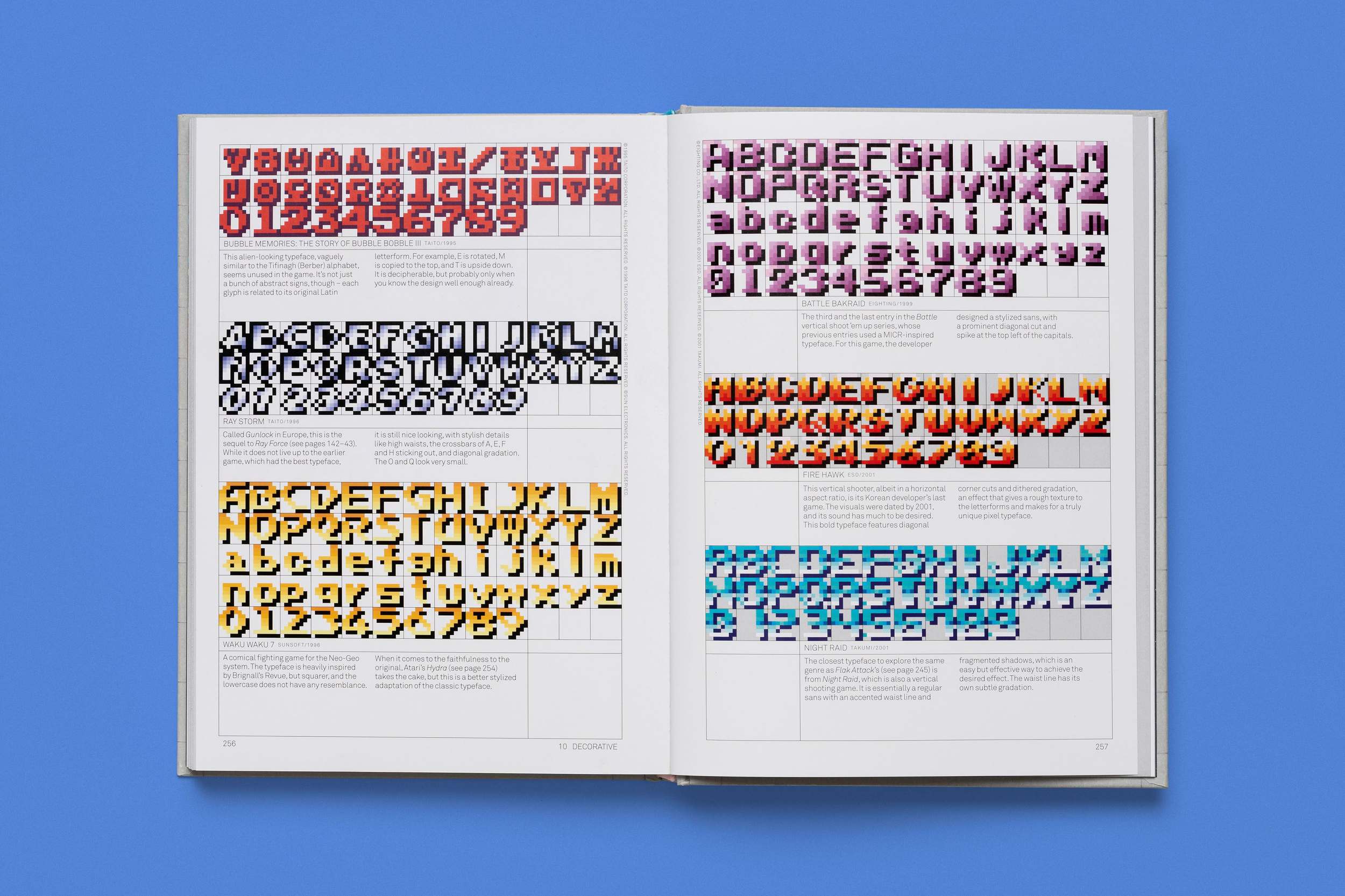

There’s gradients and gore! Pink bubblegum and illuminated letters! B’s that look crunchy and mad! W’s that absolutely hurt just to look at them! Each of these detailed illustrations shows how entirely bonkers Toshi’s research was for this project was and I can’t fathom how much time must’ve gone into collecting these assets. Toshi happens to write about the work rather rather matter-of-factly in the introduction though:
I wanted to share my passion, so I started going through thousands upon thousands of arcade games, documenting the typefaces that appear in each to the best of my ability. I wrote scripts that convert the images into fully functional colour typefaces. I categorized them, examined them, and in the process learned about the whole industry of arcade games, not just that of their typography.
Along the way, I found great games I had never heard of and terrible games whose typography is their saving grace.
The book is nothing short of beautiful and has all the hallmarks of a book written by a type designer: meticulously researched to the point of being embarrassing and also being the textbook definition of “yikes” in scope.
Speaking of “yikes” in scope, this reminds me of another intense project from Toshi called the Wolpe Collection — it’s a series of typeface renewals from the 20th century German designer Berthold Wolpe. Everyone is familiar with Wolpe’s work; a casual stroll across London and you’ll see his letters on almost every street sign in the city. But this collection of Toshi’s is so impressive to me because he rummaged through archives to collect as much of Wolpe’s work as possible before redesigning them as accurately as he could.
And the results are remarkable.

Unfortunately I have to run, otherwise I would spend 30,000 words lovingly describing why I adore each of these five typefaces in the collection; Albertus Nova, Wolpe Fanfare, Wolpe Pegasus, Sachsenwald, and Wolpe Tempest. But I have an affinity for Albertus Nova especially and for reasons beyond my comprehension I am drawn to the capital H like a moth to the flame:

This video about the project details how much care went into this revival project and I highly recommend you watch it because it’s the sort of thing I find endlessly inspirational; collecting work from the past, reinterpreting it, fixing problems as you go, and ultimately making a rather beautiful thing.